Professional Practices 2

1.2 — Web Improvement

Description

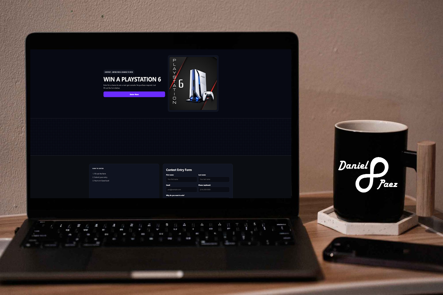
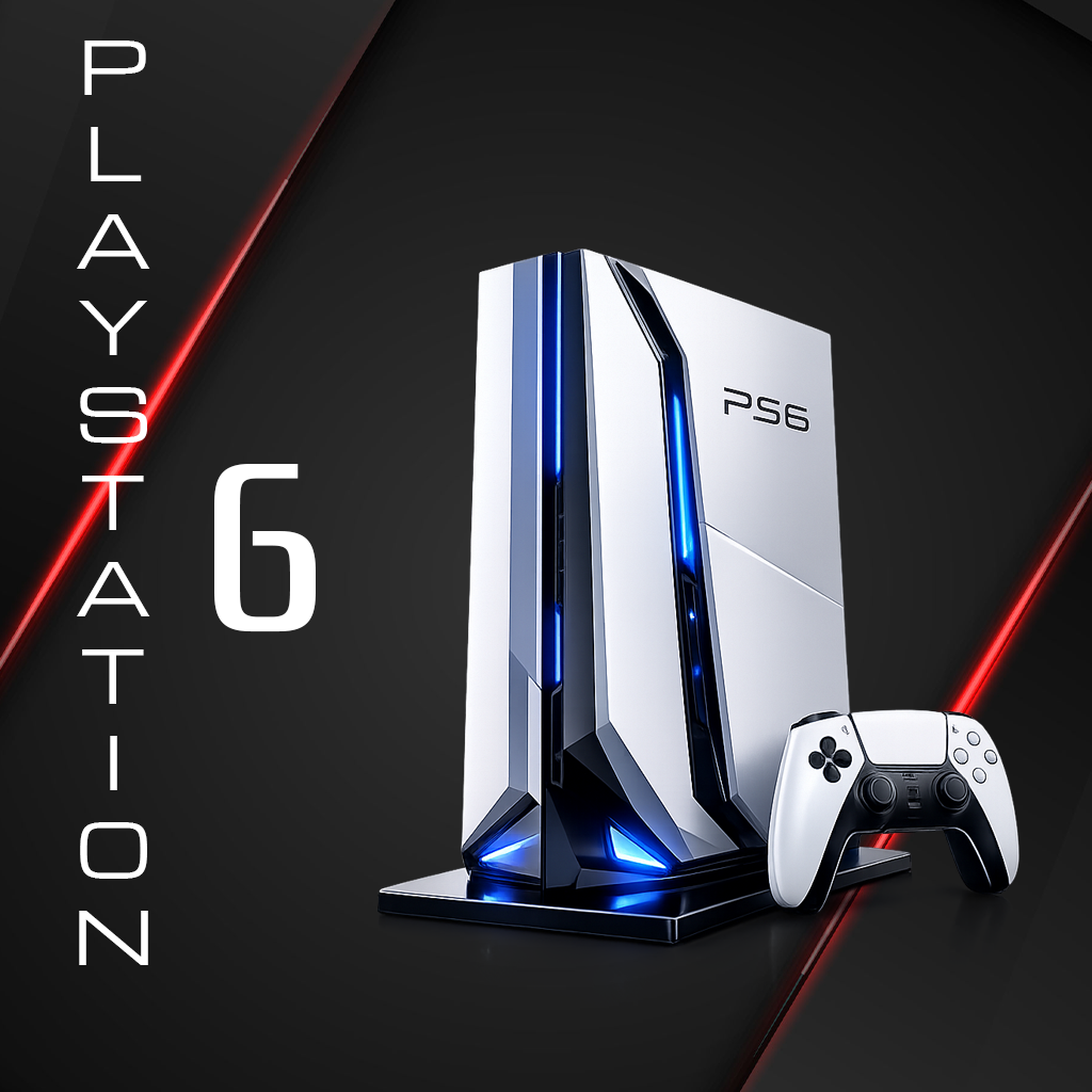
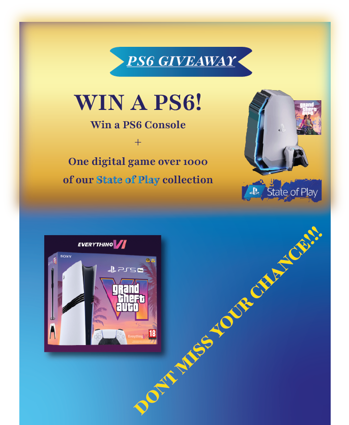
For this project, I decided to revisit and improve the contest website I created four semesters ago. The original assignment was to promote an imaginary product, so I chose to design a PlayStation 6 concept because it’s a globally recognizable product with a strong visual identity and a huge audience. Going back to it gave me the chance to refine the design with what I’ve learned since then—cleaner layout, stronger hierarchy, and a more polished presentation that feels closer to a real marketing website rather than a school prototype.

Challenge

The main challenge was making the website fit the same thematic and visual language as the poster. Both pieces needed to feel like they belonged to the same campaign, with consistent typography, mood, and style, without the website feeling too “separate” or generic compared to the poster.

Solution

To solve this, I recreated the entire website and the poster from scratch, using the poster’s theme as the foundation for the web design choices. I rebuilt the layout and visuals to match the campaign style, ensuring consistency across both deliverables and creating a unified identity between print and web.

1.3 — Print Improvement

Description

For this project, I decided I wanted to improve my print poster for the Vernissage. We were tasked to present a bundle for our Vernissage event, which required a cohesive design that would effectively communicate the value and excitement of our graduation. The assignment consisted in creating a bundle that would be up for vote and had to be revolving the concept of "movement". For my bundle, I decided that I wanted to create something that reflects my personal style for web design but implemented in a event context.

Challenge

The challenge for this project was that I started with a basic idea and I tried to go from there, but I realized that my idea wasn't fully developed and needed more refinement to effectively communicate my personal style. I tried to create something that resembled how everyone in the class see themselves, but not something that represents my design style. After a conversation with our teacher Atie, I realized that a different approach worked better for this project.

Solution

The solution was to take a step back and reevaluate my approach. I tried focusing on the things that I like about design instead of the things someone else would like in design. At the end I am very comfortable with how everything turned out in the end.

1.4 — Branding Design Improvement (Multimedia)

Description

For this part of the project, I designed the promotional poster for the same imaginary PlayStation 6 concept. Since the product doesn’t exist in real life, the poster had to feel believable while still looking like a high-end marketing piece. The goal was to create a poster that could realistically belong to the same campaign as the website, using matching typography, color palette, and overall mood so both pieces feel connected.

Challenge

The main challenge was integrating AI into the poster in a way that looked intentional and professional. Because the PS6 is imaginary, I needed an AI-generated product visual that would look convincing, and then I had to place it into a poster layout without it feeling random or “pasted on.” It also had to match the website’s theme. Same style, same energy, same visual identity.

Solution

To solve this, I selected an AI-generated product image and built the entire poster design around it. I chose a background that supported the product, then chose fonts, spacing, and colors that matched the website’s thematic. By treating the AI visual as the centerpiece and designing everything else to support it, the final poster feels cohesive, realistic, and clearly part of the same brand campaign as the website. Sometimes, less is more.